
Tutorial: Fixing Data Visualizations - Parent Survey Data

I like to check out r/dataisbeautiful on Reddit, although to be honest, I find a lot of what is posted is … not beautiful. And also not a great visualization of the data being shared. So why not try my hand at a better visualization?
This exercise is a visualization of the results of a survey of parents ranking what is most important for their children from the following topics: think for yourself, work hard, help others, obey, be well-liked. The same survey was conducted yearly or bi-yearly from 1986 to 2022. It’s not clear if the same group of parents were surveyed every year or even how many parents were surveyed.
The original visual

While this looks very pleasing to the eye, how well does it actually communicate the data?
We can tell that “to think for yourself” has probably been the most important topic every year, and “to be well-liked or popular” has been the least important topic every year, but what about all the middle topics? How do they rank?
Additionally, there’s no y-axis, so it’s hard to tell what percent selected what level of importance for each topic. And even if there were a y-axis, because of the stacked bars, it would still be hard to tell what percent selected each level of importance, unless data labels were added.
What would I do differently?
While there are so many different types of visuals available to use … more times than not, I find myself coming back to the basics.
A line graph. More often than not, this is a much better way to compare data if you are trending over time.


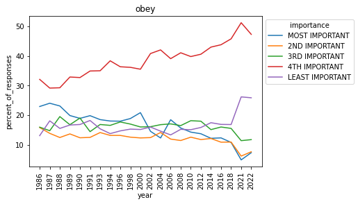

Separating each ranking into its own line instead of a stacked bar, and also adding a y-axis makes it easier to see how each level of importance has changed every year.
However, instead of comparing each topic to itself by importance, what if we looked at the “most important” and “least important” categories on their own by topic?
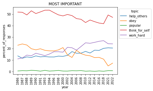

Looking at the data this way, we can see that the number of parents selecting “obey” as the most important has decreased over time, and the number of parents selecting it as least important has increased. Additionally, the percentage selecting “work hard” and “help others” as most important has slowly increased.
What do you think? Are my visuals better or worse? Reply and let me know!
Get my code
I used Python to work with this dataset and create visuals. I’ll walk through a summary of what I did below, but you can also access my notebook with all of my code.
Go straight to my code on GitHub. Or get the data and create your own visuals - if you do, let me know what you create!
Step One: Import libraries and import the data.

Step Two: Prepare the data for visualization.


Step Three: Create visuals.


Access my full repo for this project on GitHub.